
Kairo sells AI coaching to companies. Not the kind that books a workshop and disappears, but a system employees actually talk to when a hard conversation is coming. My job was the page that has to explain all of that before anyone scrolls.
A note on names: the AI startup I designed this for is still in stealth, so it appears here as Kairo, its products as Kai, and every screen is my own 2026 rebuild with sample data. The live version is one click away.
Two Sceptics, One Page
A page like this is read by two people who distrust it for opposite reasons. The buyer has seen enough products with AI in the name to assume this one is a wrapper. The employee who will actually use it assumes it was bought to score them.
Ignoring either of them is how these pages fail. So the page takes a position in the headline instead of hedging. It is a claim about who is in charge, the person or the software, made before the product is even named.
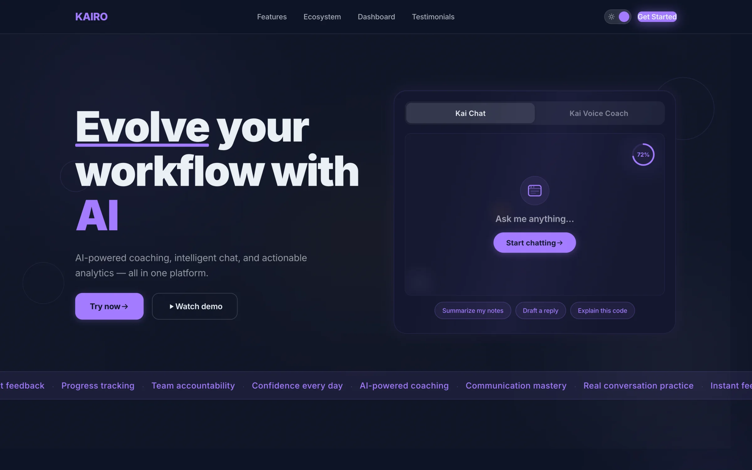
The hero in dark theme. The product sits beside the headline from the first frame: Kai Chat on one tab, the voice coach on the other.
Show the Product, Not an Orb
The panel beside the headline was the argument I cared most about winning. The default for a B2B AI site is a glowing orb, an unreadable dashboard, or a stock photo of people pointing at a laptop. None of them say what the thing does.
A working slice of the product does. The visitor sees the chat, the voice coach and the prompts people actually start with, and understands the product, the tone and the boundary in about three seconds.
Everything else on the page is sequenced behind that: what it does, who it is for, what it costs you to try, and the proof that makes those claims survivable.
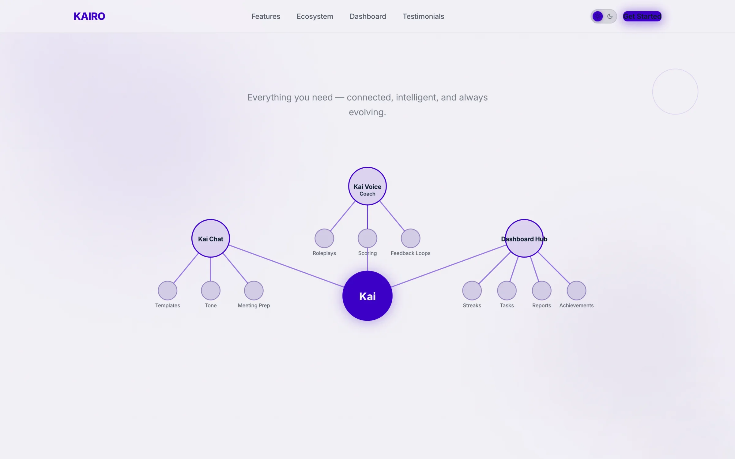
The ecosystem map in light theme: chat, voice coaching and the dashboard hub, all branching from one assistant.
The Small Things That Took Longest
The trust signals. The customer logos, the line about professionals already growing with Kai, the ticker of outcomes along the bottom edge. Each one is a few words and each one was argued over, because on a page whose job is a demo booking, those are the difference between a click and a closed tab.
The rule I held to: every number on the page has to be one the company can defend in a sales call. A landing page that overstates gets found out in the first meeting, and then the whole page is a liability.
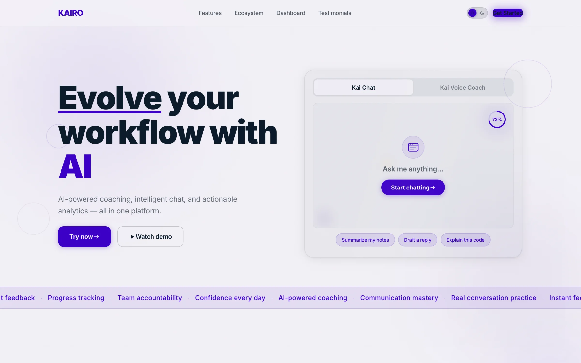
Light theme. The same grid and type scale, so the page reads as one system in both.
What I Did
Designed the full page: hero, product sections, proof, and the path to a demo booking
Contributed to the frontend build, so it shipped as designed rather than as interpreted
Set the type scale, spacing and colour that the product suite then inherited, which is why the dashboard, chat and voice coach read as the same company
Built the responsive behaviour properly, including the scrolled and signed-in states most marketing sites forget
Rebuilt and renamed the page in 2026 as the live demo linked from this case study
Where It Stands
The original page shipped as the startup's public front door. I worked on it as a design consultant with a frontend contribution, alongside their team, rather than as sole owner of the product. The version linked here is my own rebuild, renamed and recoloured while the company is in stealth.