
A landing page has to win three seconds. A dashboard has to survive three months.
A note on names: the AI startup I designed this for is still in stealth, so it appears here as Kairo, its products as Kai, and every screen is my own 2026 rebuild with sample data. The live version is one click away.
The Room You Come Back To
This is the screen a Kai user opens on a Tuesday morning. Their company bought the product, somebody sent a link, and now there is a piece of software asking for a slice of a day that is already full.
The whole thing lives or dies on one question: does it give me something worth doing in the next five minutes, or is it another tab I close?
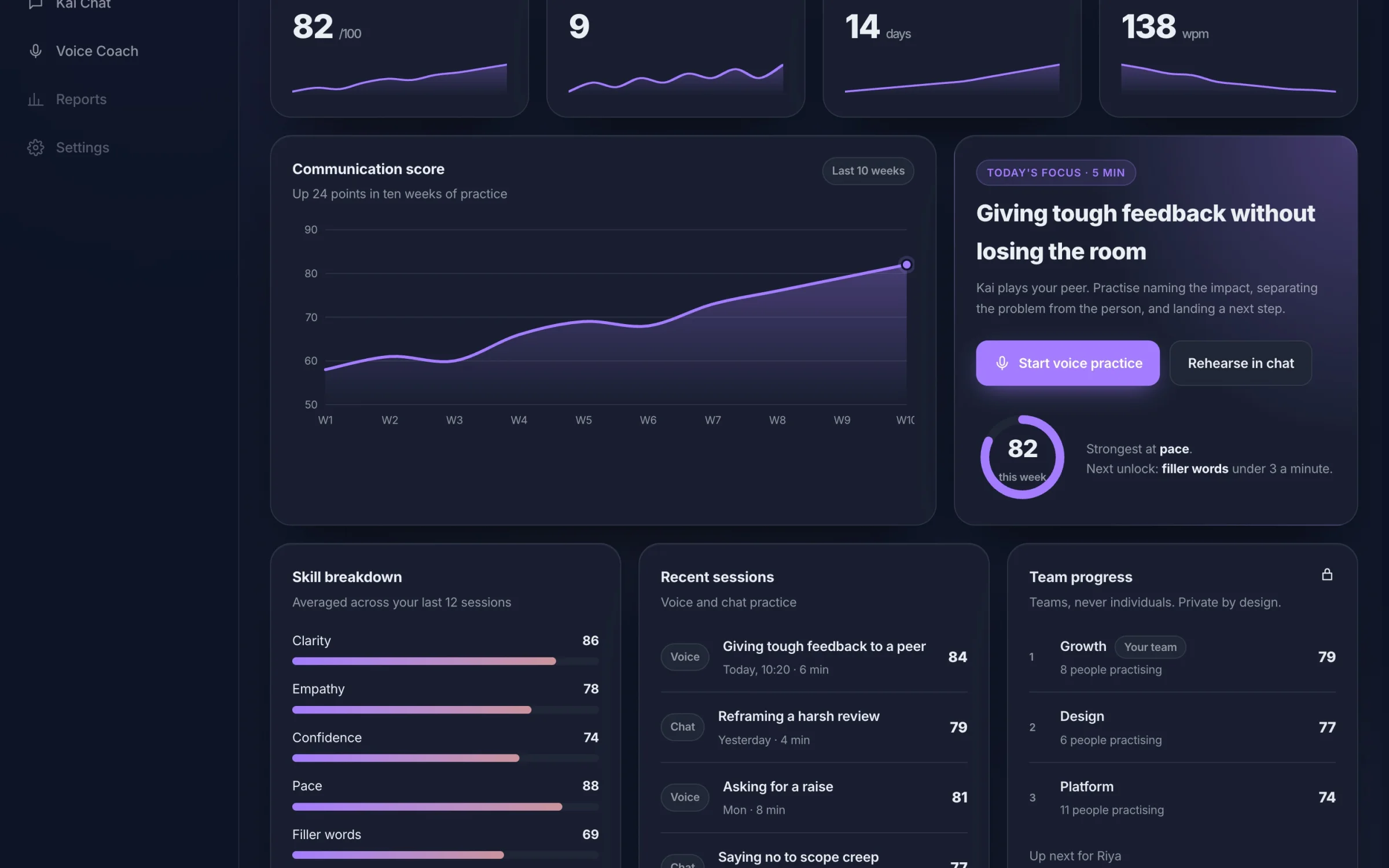
The 2026 redesign in dark theme. Four numbers that matter, the score trend, and Today's Focus beside it with one button to start.
One Thing First
Most dashboards open with a wall of numbers and leave the user to work out what to do about them. I inverted that. The focus card names one skill, a time cost and one button: giving tough feedback, five minutes, start voice practice.
No interpretation required. You do not have to understand your own engagement metrics to know what that card is asking of you.
Chat and voice practice are one tap away from that card. Progress sits lower, because reviewing your own progress is not the behaviour the product needs from you on a Tuesday morning. It is the behaviour it needs on a Friday.
Designing the Locked State
In the original free tier, company benchmarks and weekly activity were locked. The easy call was to hide them and show a clean screen.
I kept them on screen, dimmed, with the padlock and the real module name visible. Three reasons, in order of how much they mattered:
Hiding a feature makes the product feel small. A visible ceiling makes it feel like there is somewhere to go
It is honest about what the paid tier actually contains, which is a better upgrade prompt than a modal that appears when you click the wrong thing
It stops a new account collapsing into empty space, and the empty account is the state most users see first and most teams design last
Teams, Never Individuals
The original roadmap had a public leaderboard. I argued against it: a product that exists to take the social pressure out of hard conversations cannot rank colleagues against each other. The redesign keeps progress team based and private, and says so on the card.
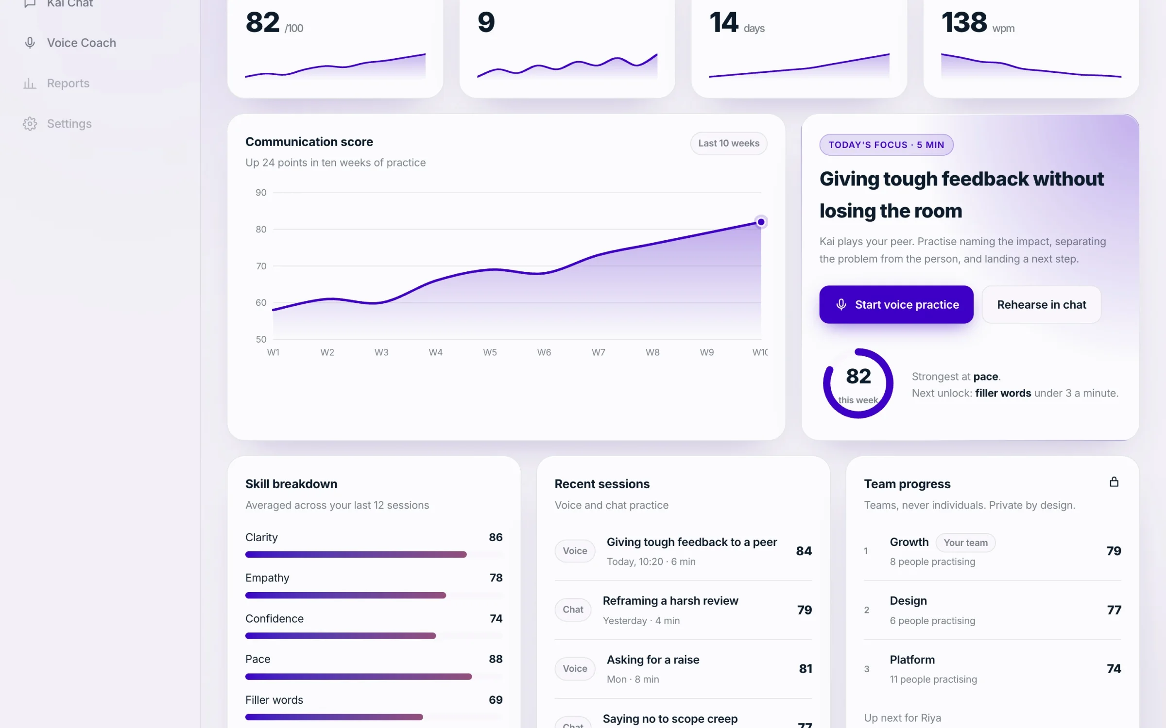
Light theme, same grid. Skill breakdown, recent sessions and team progress, private by design.
Two Themes, One Grid
Dark and light are not a taste toggle here. HR leads present this screen in meeting rooms with the lights up. Employees use it alone at a desk, often late. Both are real contexts and neither is the default.
So the grid holds still between them. Only the surface changes. Nobody should have to relearn where their own progress lives because the theme changed.
What Changed in 2026
A KPI row with sparklines, so the trend is visible before the detail
One score trend chart in place of several small ones
Today's Focus kept as the lead, now linking straight into chat or voice practice
The same tokens and type as the landing page, so the suite finally reads as one product
What I Owned
Information hierarchy and the module grid, across both themes and every account state
Empty, locked and first run states, which is where most dashboard designs quietly give up
The component set that the chat and voice products reused, so the suite reads as one system rather than three
I worked on the original as a design consultant to the startup's team, and the engineering was theirs. The 2026 rebuild linked here is mine, with sample data.